
bayside community hub : logo redesign
Role:
Lead Graphic Designer
Timeline:
February 20 - May 10 2025
Skills:
Visual Design
Prototyping
Collaboration
Brand Management
Problem Solving
Tools:
Adobe Illustrator
Adobe inDesign
Adobe Photoshop
analysis:
context:
Bayside Community Hub is an online platform designed to link local businesses and encourage professional relationships in the Bayside Council area of South-East Melbourne.
The client is in the process of refreshing the website for the Community Hub, and requested a refreshed logo and revamped colour palette for the website.
first client meeting:
Our first meeting was dedicated to thoroughly understanding the client's concerns with their previous logo. We gained a deep insight into their brand identity, analysing existing audience demographics and pinpointing the core message they wanted users to receive when viewing the logo. This collaborative session also allowed us to walk them through our creative process, communicating our commitment to delivering a new logo, a harmonious colour palette, and carefully selected fonts, all optimised for versatility and brand recognition.
previous logo:

overly complex colour palette
lack of a transparent background version
brand values not visually clear
overly complex design elements
limited colour palette versatility - clashes
no clear brand guide - logo only
To address the identified challenges with the previous logo, our redesign process followed a strategic, user-centric approach focused on enhancing clarity, versatility, and brand resonance.
brainstorming:
Throughout this phase we wanted to focus on representing the client’s brand as truthfully as possible. To do this, we brainstormed various ways we could symbolise the city of Bayside and its connection to the beach, as well as the tight knit community and its importance to the brand’s identity.
From here we began crafting a variety of logo variations. We explored a variety of typeface options, as the client had been clear they wanted the logo to include the business name. We settled on a rounded sans-serif, as we felt this embodied the open hearted nature of Bayside, as well as being visually clean and professional.
We then explored the current colour palette and its flaws. Our main problem was the very light yellow, which often clashed with the other colours and was difficult to see. Furthermore, the colours themselves did not represent the beach as much as the client wanted. Our aim was to simplify the palette as much as possible, whilst still allowing for versatility in design elements.
We explored a variety of colour palettes to achieve this. After getting down to our final two favourites, we then combined the colour palettes with our top eight design ideas. This led us to decide upon the more versatile palette as this aligned more with our clients ideals.

refined colour palette:
simplified
reduced the number of hues to make the palette more visually cohesive and impactful
more versatile colour range
all colours are recognisable and familiar to the local audience
colours are beach themed but still striking and visually interesting

final logo design variations:
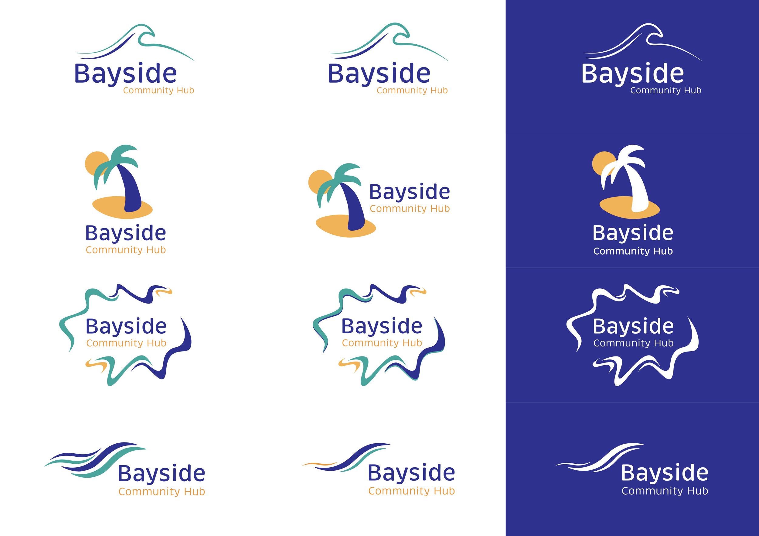

final client consultation:
In our final client consultation we presented a deck explaining our design choices, as well as the 7 finalised logo options, with colour and style variants of each. After our presentation the client narrowed down their favourites between logo 1 , 3 and 4. The client had a few tweaks and suggestions to the designs. To maintain communication and transparency we performed these changes in front of the client, and compared various versions of each of these three designs so that the client was able to see the differences and how they would appear on various backgrounds.
By the end of the consultation the client was overjoyed with the final logo design and colour palette and expressed their delight with the openness of communication and our willingness to listen to their ideas, needs and wants.
The final logo is representative of the client’s needs and presents a clear and coherent brand that is recognisable and familiar to locals. The logo is versatile and designer friendly and is a result of a successful collaboration with the client.
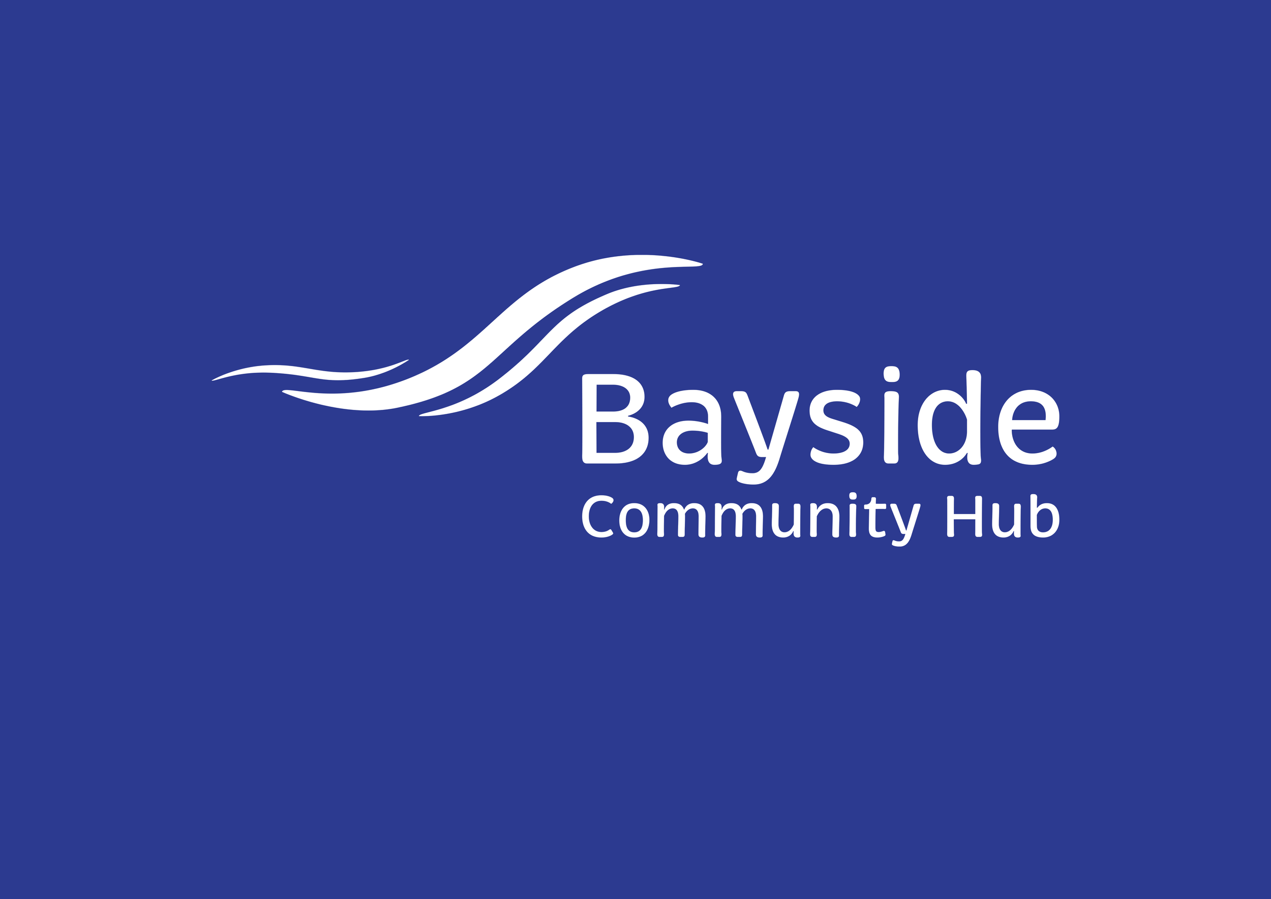
The final logo design utilises wave-like symbolism to represent the beaches that surround Bayside city. The colour palette is both representative of the beaches themselves, and is recognisable to locals due to visual similarities to various sporting teams nearby.
The colour palette is fresh, bright and eye-catching whilst remaining professional and simple. We also designed a white version of the logo for increased versatility across platforms, as well as transparent versions of both the white and coloured logos.
The wave motif is referential to the Bayside city council’s own logo, once again inspiring familiarity and trust within locals. The logo embodies the meeting of the waves and the shore, with the meeting of local businesses utilising the Bayside Community Hub.

logo in white: