
bespoke therapy melbourne : logo and brand design
Role:
Lead Graphic Designer
Timeline:
July 20 - August 26 2025
Skills:
Visual Design
Collaboration
Brand Management
Problem Solving
Tools:
Adobe Illustrator
Adobe inDesign
Adobe Photoshop
analysis:
context:
Bespoke Therapy Melbourne is a new holistic based therapy clinic based in Melbourne, Australia.
The client is in the process of building the business as well as a new website. As such, she needed a recognisable and flexible brand that emphasises calmness and tranquility, representing the guidance and support the clinic tailors to its patients.
first client meeting:
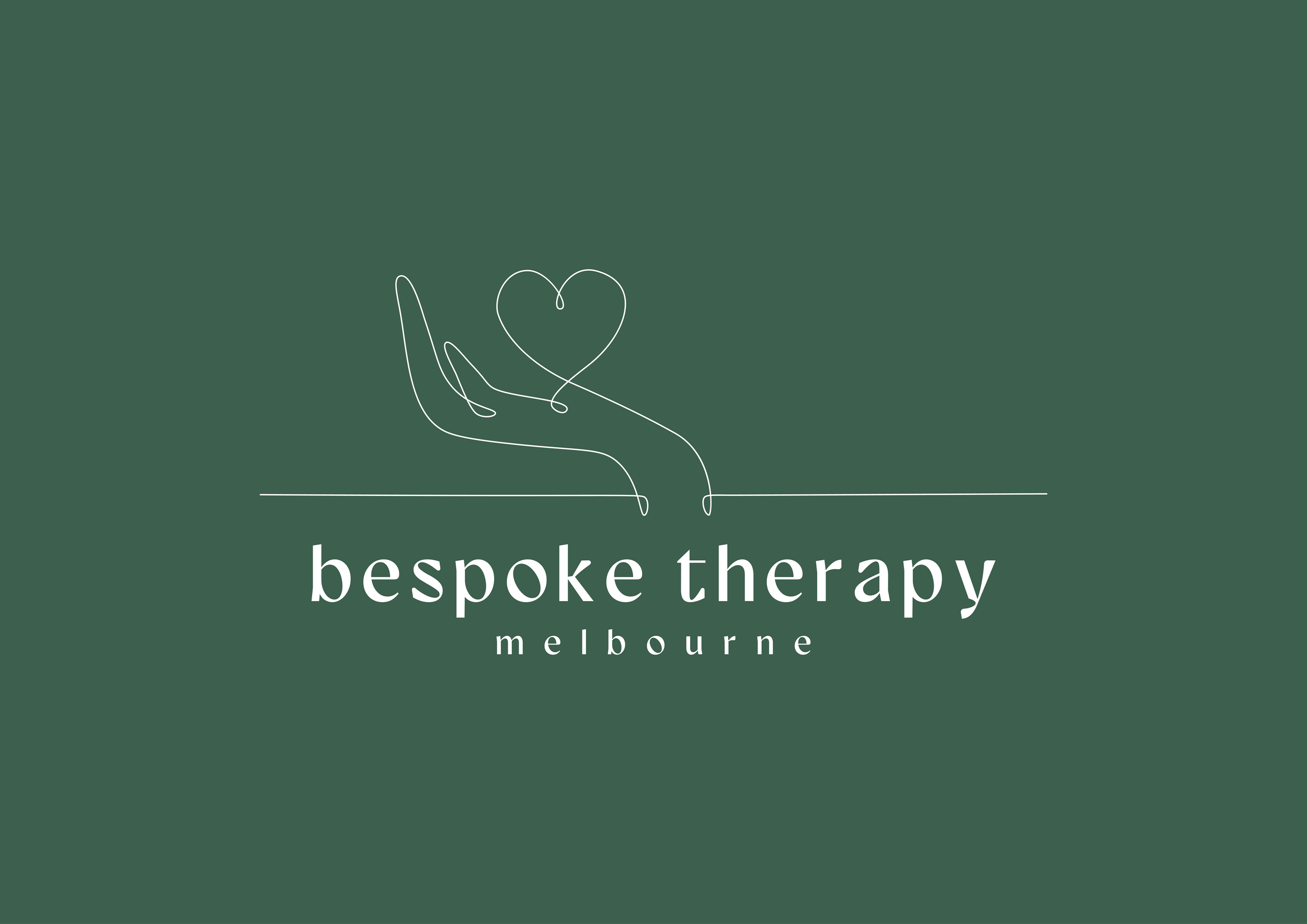
My first meeting with the client was dedicated to thoroughly understanding the client's needs. We gained a deep insight into her proposed brand’s ideologies and pinpointed the core message she wanted clients to receive. The client wanted a hand holding a heart as the main element of her logo, in a fine-line style. She wanted a colour palette in either green or blue that echoed tranquility, inter-connectedness and represented the journey of personal growth and the alignment of mind, body, and spirit.
This collaborative session also allowed me to walk the client through the creative process and deliverables, including a new logo, harmonious colour palette, typefaces, and business cards.
My design strategy aims to embody the empathetic approach of the therapeutic practice, using soft, flowing lines and a calm colour palette.
refined colour palette:
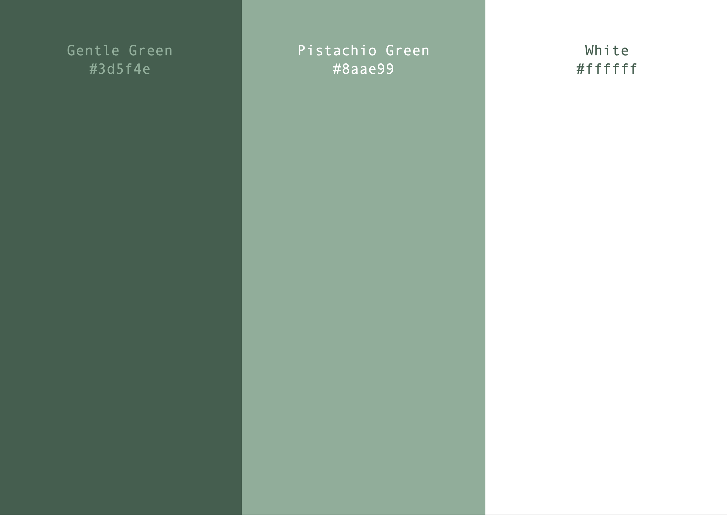
During our consultation, the client had an interest in either green or blue as the primary brand colour.
Whilst exploring both, I found that a soft green felt more naturalistic and gentle, aligning with brand values.
The primary colour is a gentle green #3d5f4e, which is supported by the secondary, pistachio green #8aae99.
This colour palette, when combined with white, allows for versatility regarding text colouring and accents across both print and digital media.

final logo design variations:
final client consultation:
In the final consultation, I presented three differing logo designs to the client based on their request. For presentation purposes I displayed the prospective logos on both a coloured and white background, to emphasise the versatility of the design and colour palette integration.
After the presentation the client narrowed down their choice to the third option. The client also requested some minor adjustments to the logo, including removing the capital letters from the logo text, and exploring different lengths of the underline of the hand.
By the end of the final consultation, the client was pleased with the final design and proceeded to request a business card design that would be complimentary to the logo and brand design.
alternate coloured logo:

final logo design:
