


mood :
prospective milk brand design
Role:
Graphic and Product Designer
Marketing Strategist
Timeline:
August 20 - September 22 2024
Skills:
Audience Research
Brand Analysis
Visual Design
Prototyping
Market Research
Brand Design
Marketing Strategy
What type of milk do you drink, if at all?
How often do you drink whole milk?
What brand of flavoured milk do you consume most?
Tools:
Adobe Illustrator
Adobe inDesign
Adobe Photoshop
Canva
Miro
analysis:
context:
As part of our university studies, we were advised to design either a new milk brand, or to rebrand a pre-existing brand.
market research:
As part of our market research we engaged in a series of surveys and group interviews with our target demographic. As such I devised a series of questions that would produce both qualitative and quantitative data.
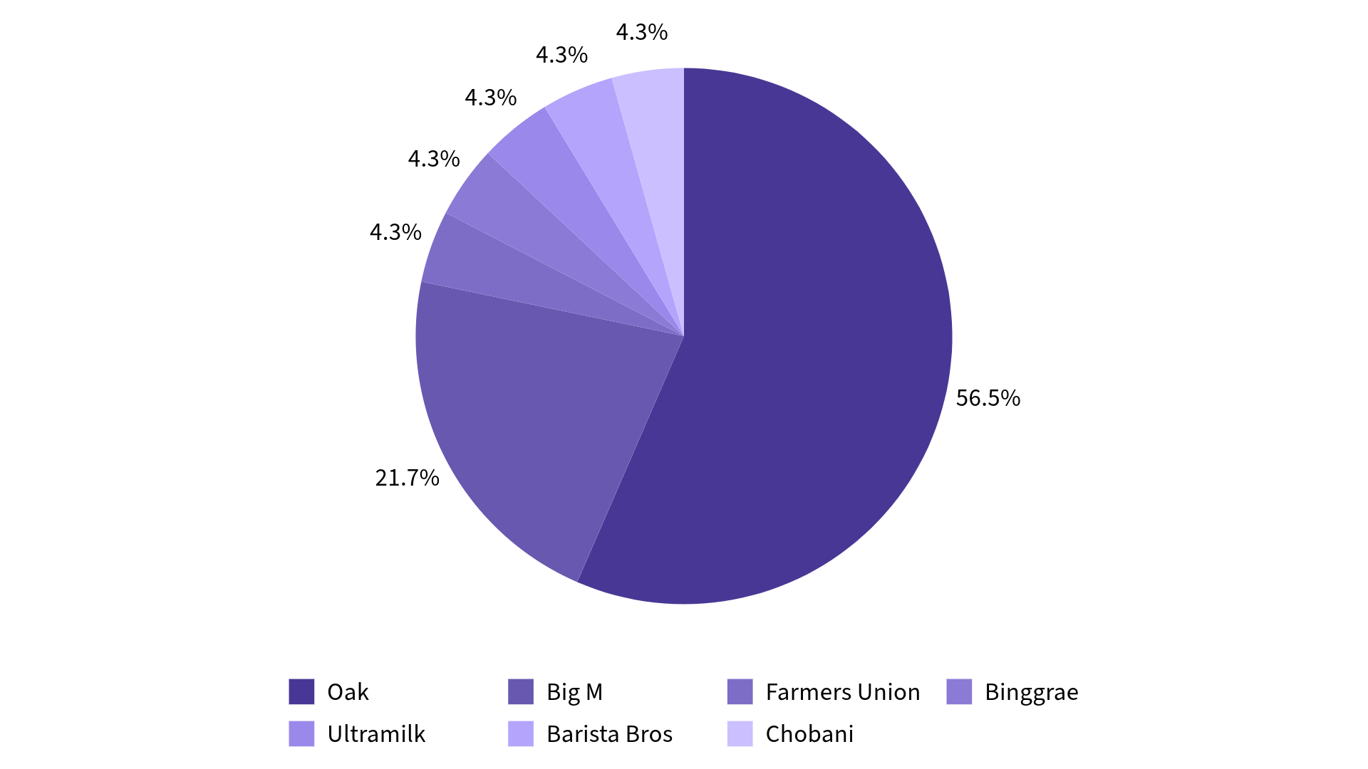
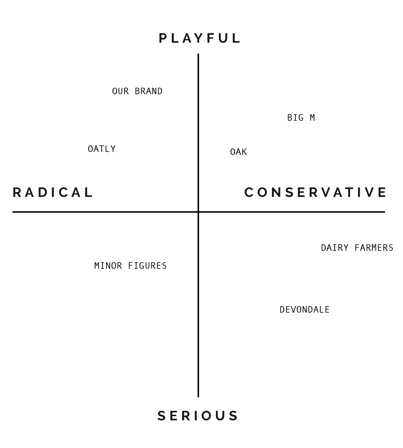
We also engaged in competitor analysis of brands such as Devondale, Oak, Big M, and supermarket homebrands.


findings
After engaging in market research, we discovered there was a gap in the market for a flavoured milk brand marketed towards adults aged 25-35. Flavoured milk brands often had cutesy childish designs, and did not offer a wide range of flavours or lactose free options.
Furthermore, whilst we had assumed milk alternatives would be more popular with our target demographic, this was not the outcome of our surveys. The majority of participants drank whole milk products in their day-to-day lives rather than alternatives such as oat or almond mylks.
We secured our brand position as a local, semi-luxury milk brand with a playful, witty brand identity and voice that appealed to adults.
SWOT analysis
Strengths:
Our competitors do not focus on the health benefits of dairy milk, which sets us apart.
Our competitors either focus on plain milk or flavored milk, with little emphasis on both, which also sets us apart as our niche targets people who love drinking dairy milk (flavoured or unflavoured).
Weaknesses:
Given we are a new brand, we do not have an established loyal customer base yet, unlike some of our competitors.
Limited starting capital as we are a small, independent start up.
Limited brand awareness or trust.
Saturated Market with many big, long-standing competitors already.

Opportunities:
People are beginning to question the legitimacy of plant-based milk as a healthier or more sustainable alternative, with experts suggesting that dairy milk is still the most nutritious.
There is a gap in the market for adults looking for milk drinks that aren’t unhealthy or childish.
There is a gap in the market for on-the-go milk products in the refrigerated section of the supermarket that have asian inspired flavours.
There is room for educating people on the benefits of dairy milk, especially compared to plant-based milk.

Threats:
Plant based milk is still growing in popularity.
Concerns over environmental impact of cows and dairy production.
Ethical concerns and popularity of veganism.
Health concerns over ‘sugary’ flavoured milk.
brand position:
Through our SWOT analysis, we noticed that dairy milk was often seen as ‘uncool’ or ‘boring’ as compared to more trendy plant-based alternatives.
This gave us the idea to frame our brand in the same cool, likeable way as plant-based milk brands. We aimed to change the narrative surrounding dairy milk products and their branding style.
We also discovered there was a lack of diary products with asian-inspired flavours on the Australian market. From this analysis, we developed a range of asian-inspired flavoured milk drinks reminiscent of trending bubble tea flavours.
Given that we were presenting ourselves as a new brand, with little brand awareness or an established customer base, we acknowledged that we would need to include launch campaigns based on spreading brand salience in our brand strategy.
As such we positioned the brand as both a playful and radical brand identity as compared to our competitors. This allowed us to create a brand framework, and a unique identity and voice.
brand framework:
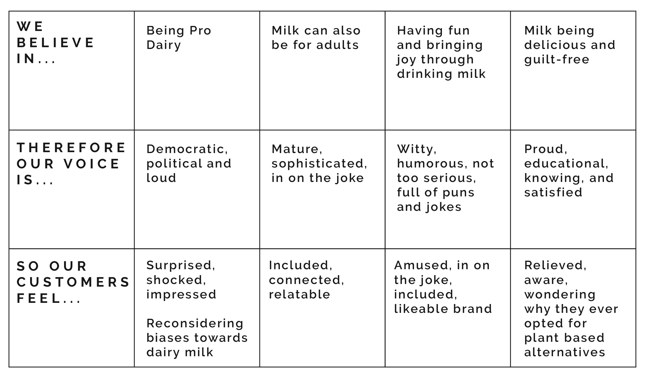
brand voice and personality:
Our brand features a witty tone of voice that conveys the fun, light-hearted personality of the brand.
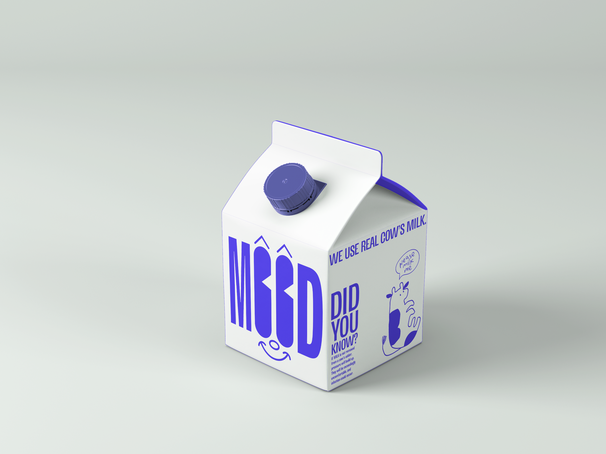
Mood is a brand that doesn’t take itself too seriously, with cheesy puns and the most loveable mascot the dairy aisle has ever seen.
Our packaging and colour palette reflect our bubbly personality. As do our organic, sketchy illustrations that suggest that we’re authentic and real.
We know we’re cool, but we like to pretend that we’re not.
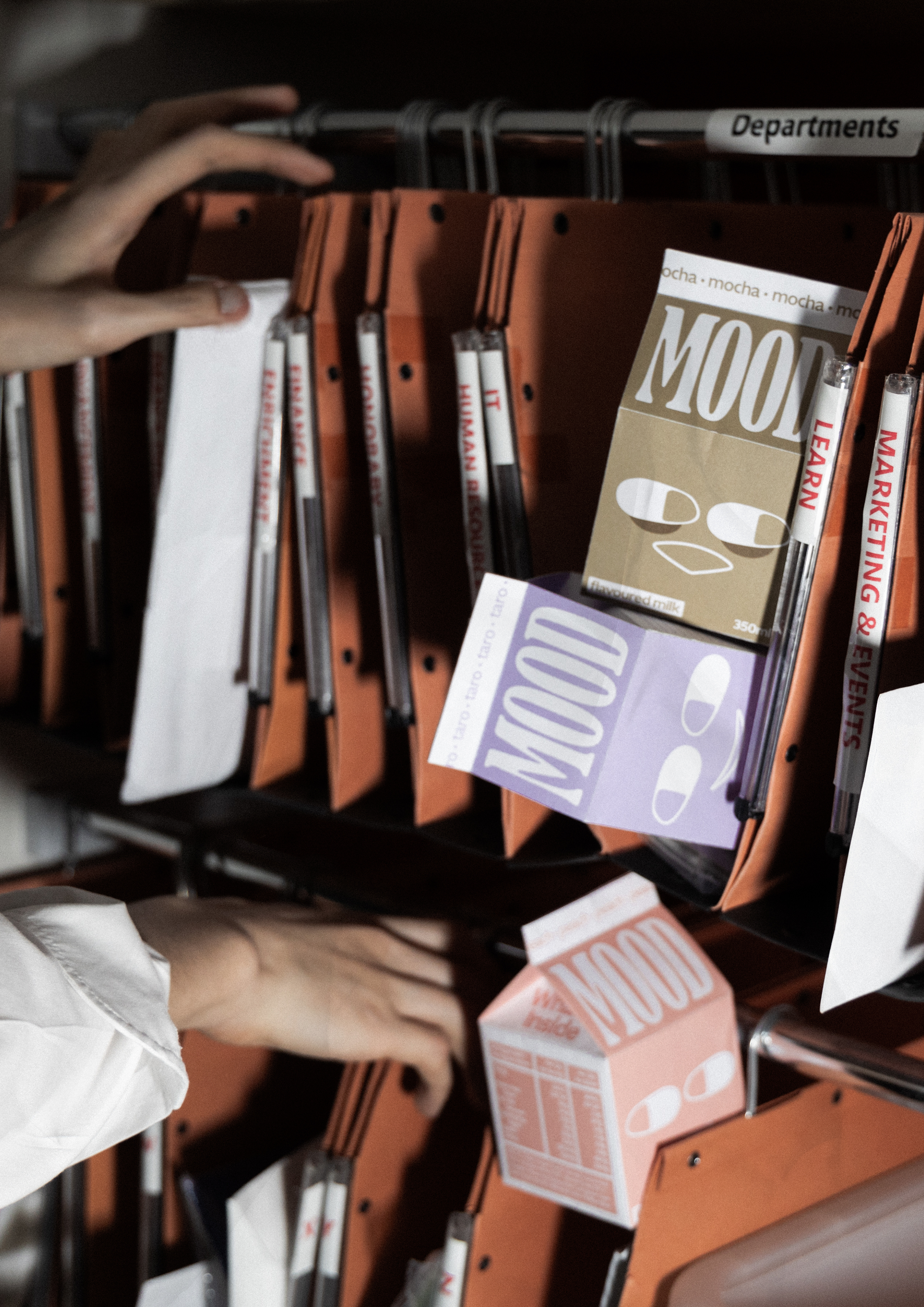
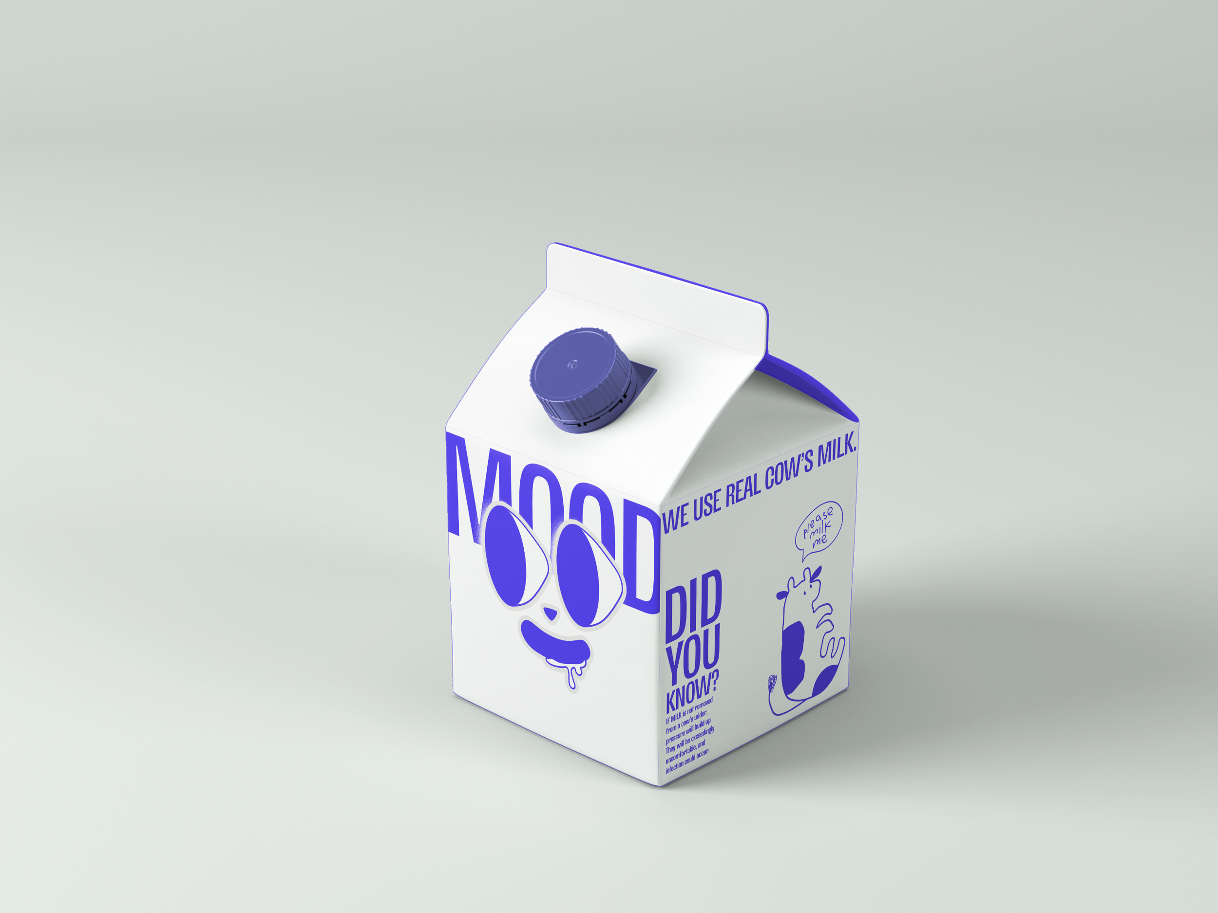
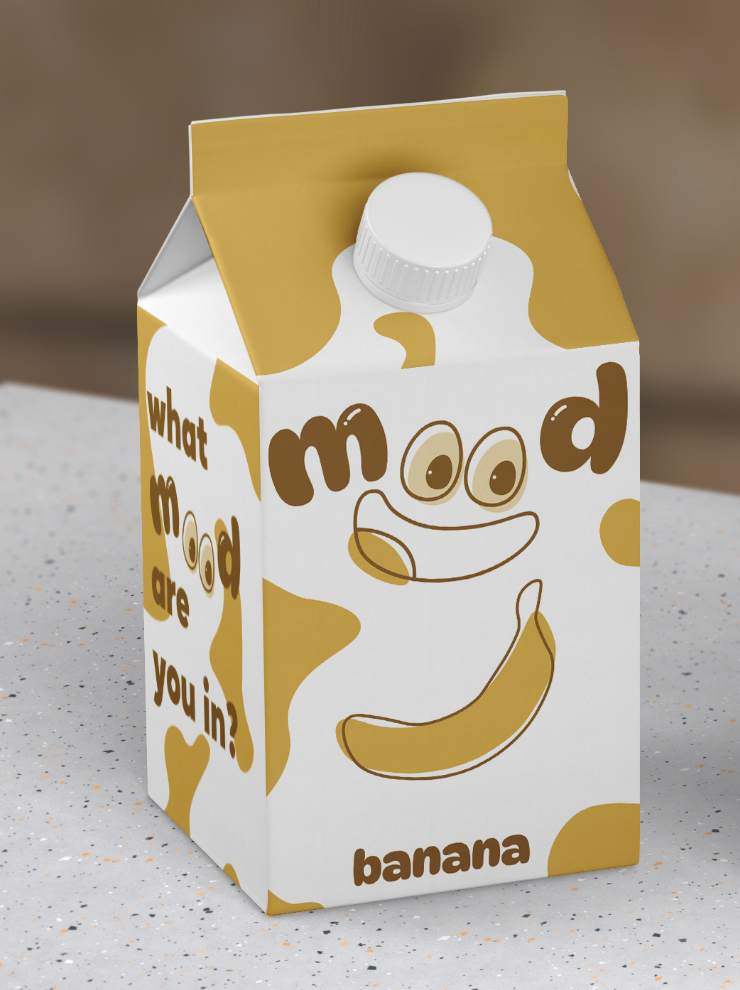
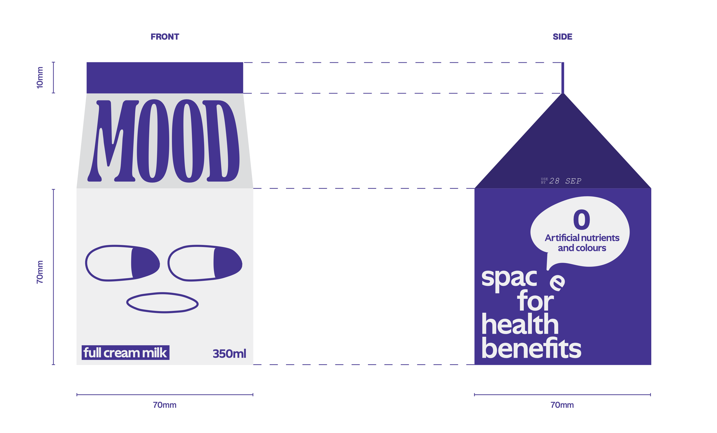
packaging iteration:
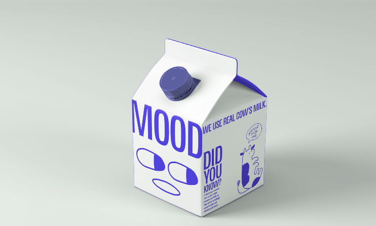
logo design:

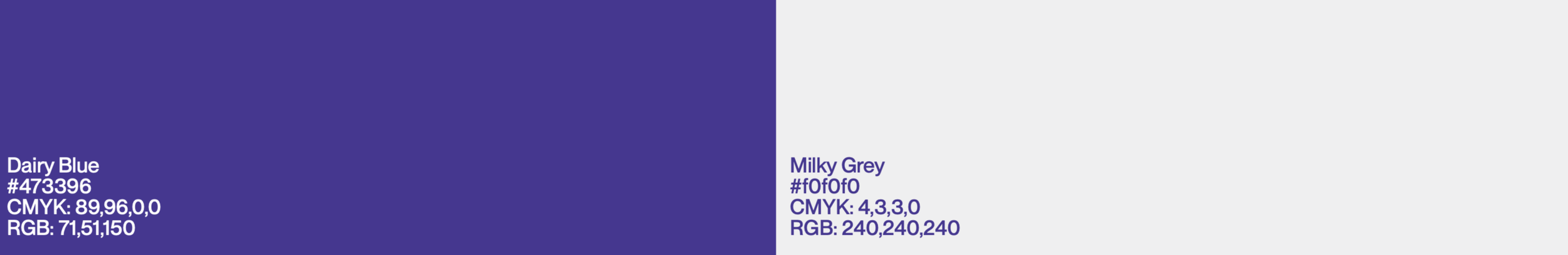
colour palette:
Primary Colours:
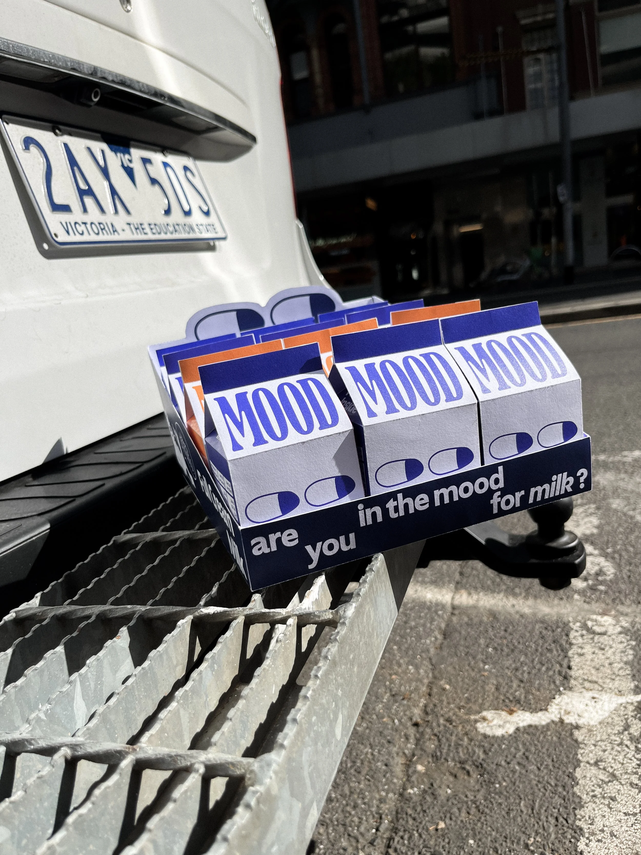
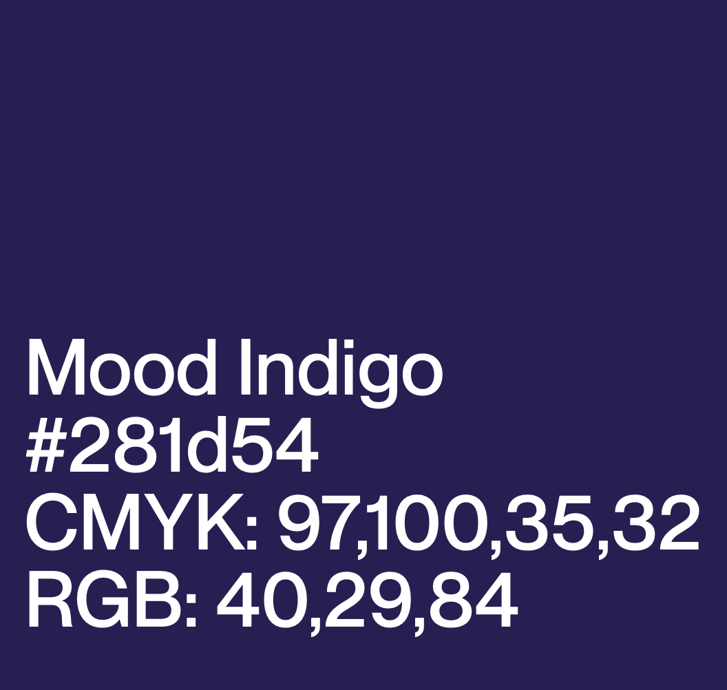
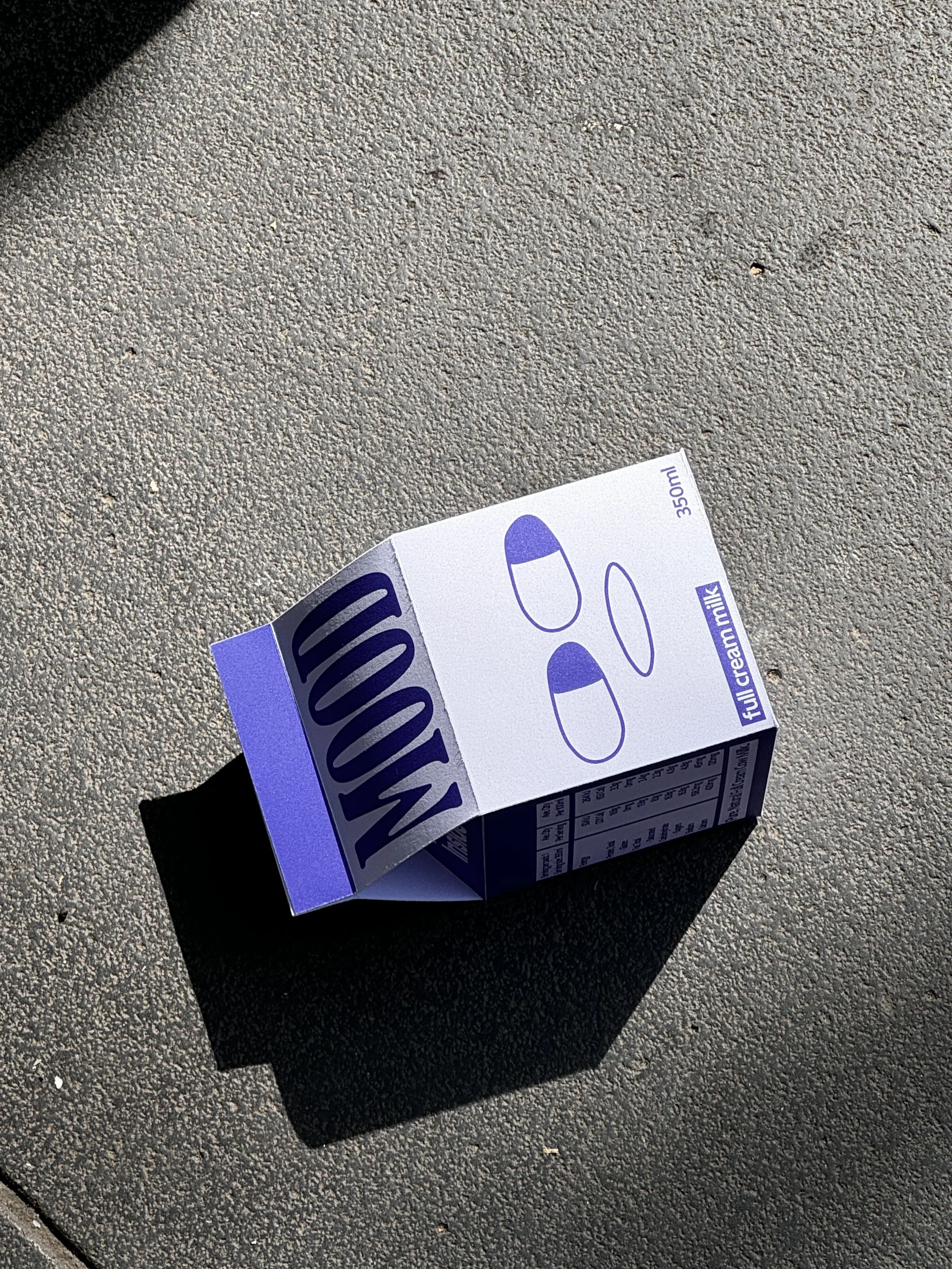
Featuring a ‘moody’ indigo blue paired with a pale grey, paying homage to the common association of milk brands being blue. These two primary colours also serve as our main brand colours, as seen on our posters, website and merchandise.
Our Lactose-Free Milk is housed in a directly complementary orange colour, to stand out visually on the shelf and provide eye-catching contrast.
Secondary Colours:
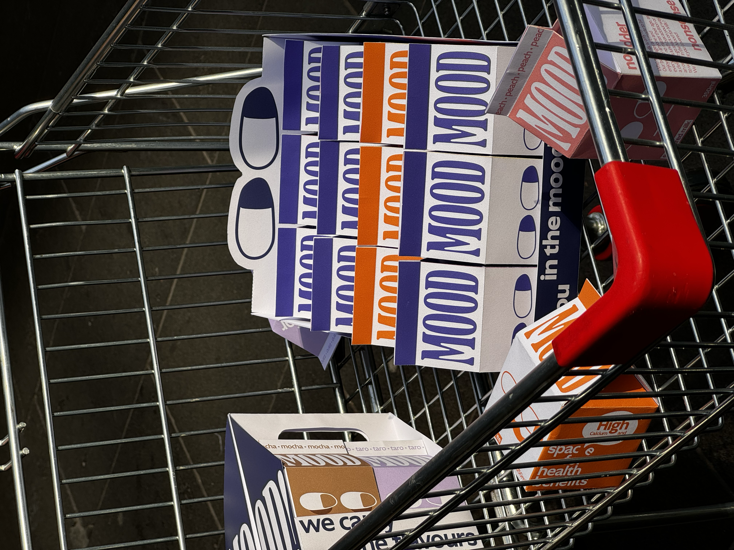
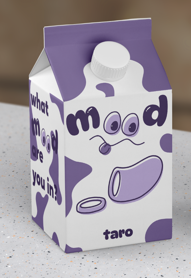
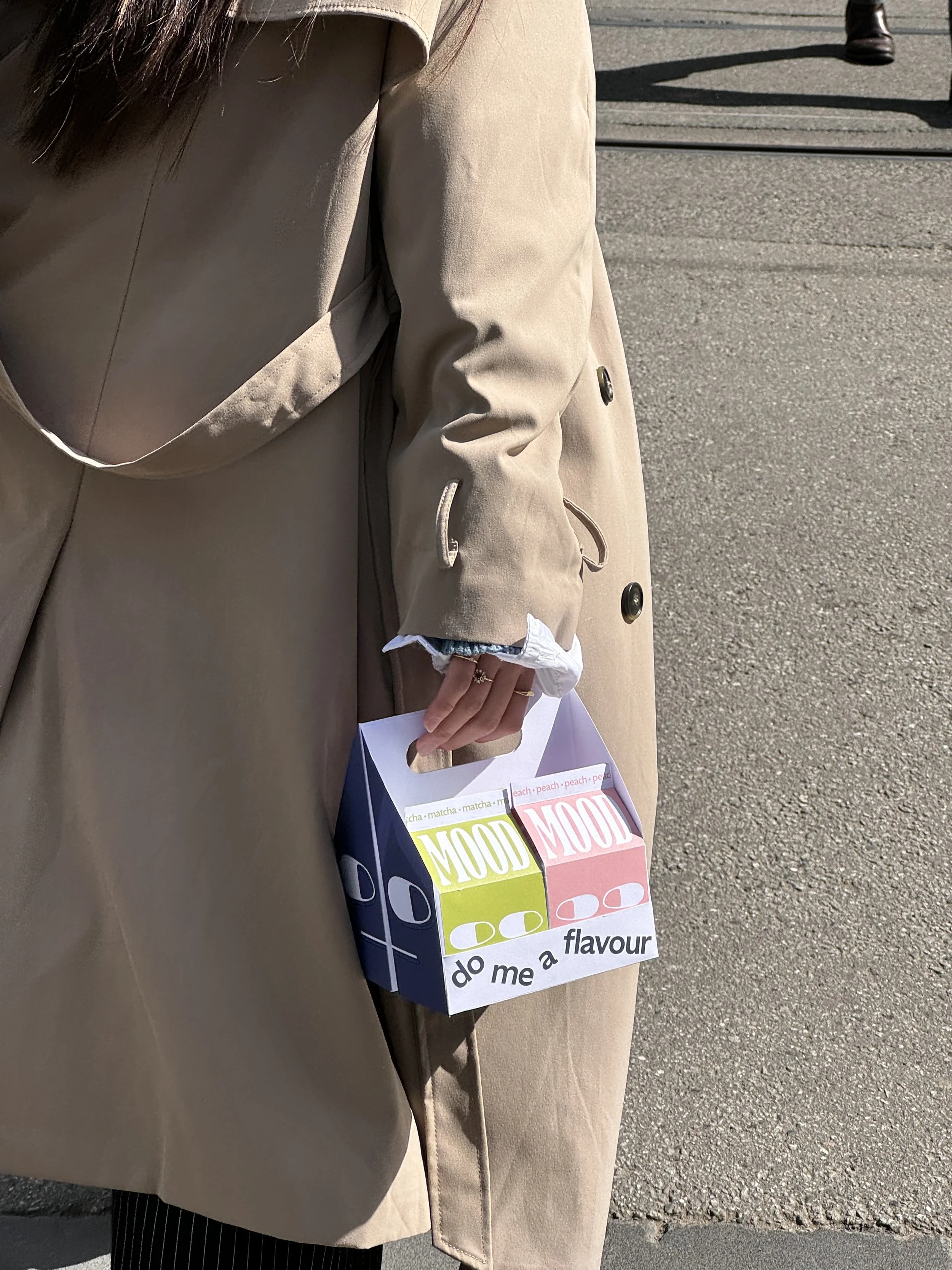
Our flavoured milk cartons feature a palette of soft pastel shades of peach pink, matcha green, taro purple and mocha brown. The colours are soft to elicit the creaminess of milk, while being unique, aesthetically pleasing and eye-catching on an otherwise chaotic, over-saturated store shelf. Each carton is paired with a pale grey to help the colours pop even further.

Master Colour:
A deep indigo that is dark enough to not clash with any of the other bright colours, while being in the same family as the primary indigo to maintain consistency.
hand-drawn illustrations:


final packaging design:
flavours packaging carousel:


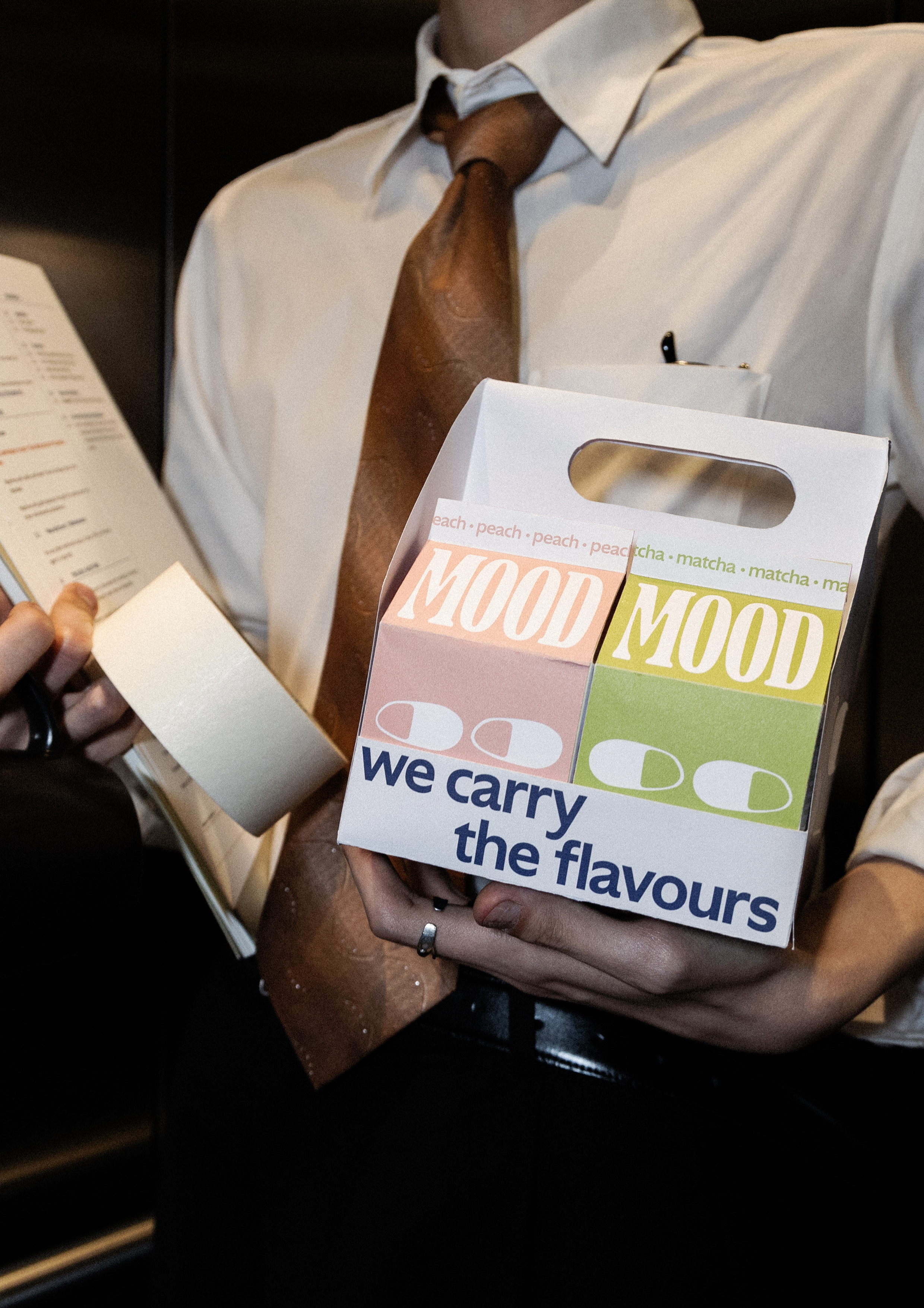
Campaign 2:
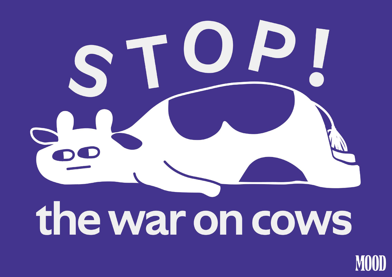
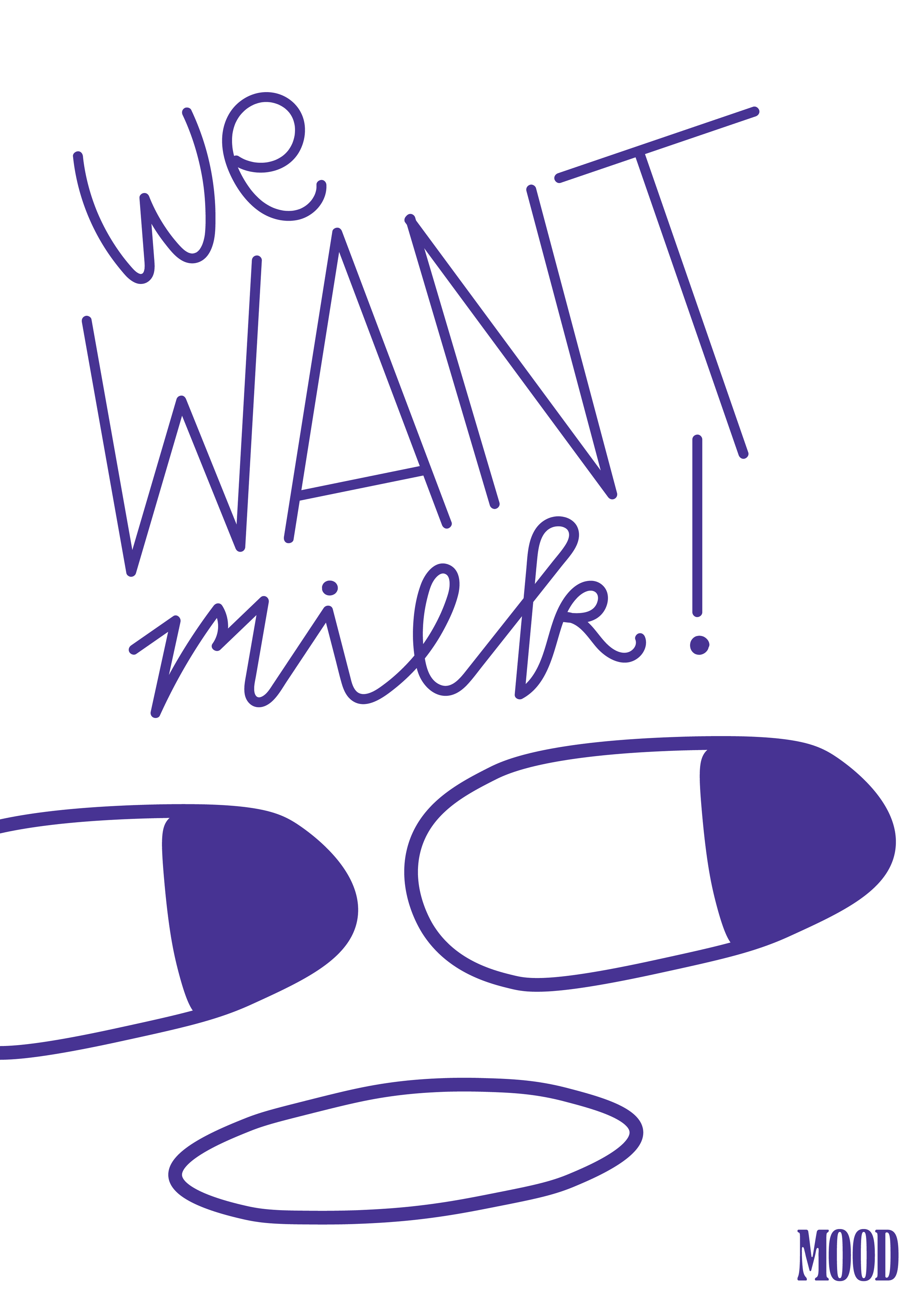
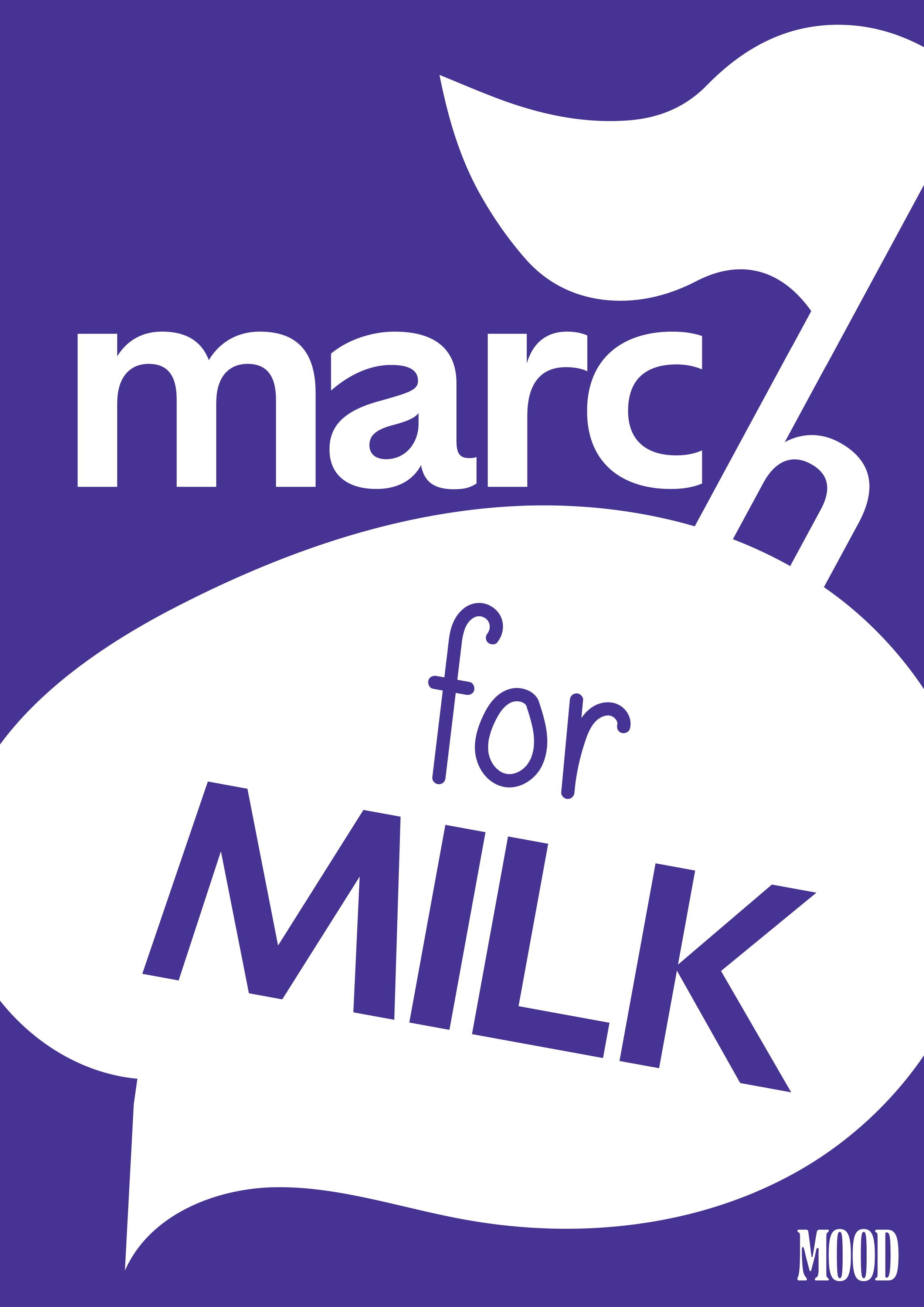
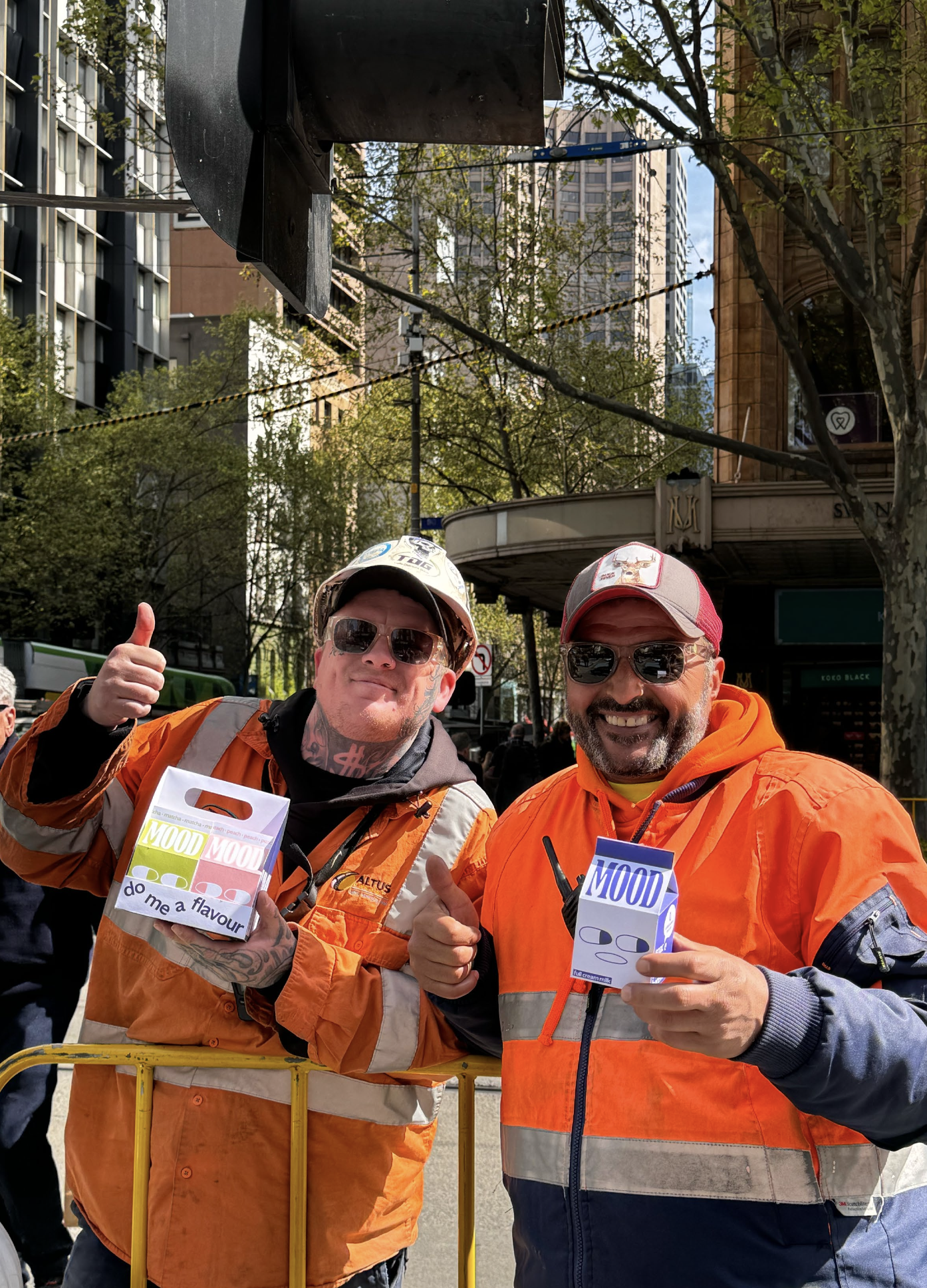
To drive home our message that we are pro-dairy and believe that cow milk has been unfairly villainised, our second campaign centres around a publicity stunt in which our employees hold a pretend-protest in the name of the dairy cow, with an outcry for justice for our dairy-giving animal brethren. Under the banner of the ‘Pro Milk Militia’, with slogans such as ‘Girls Just Wanna Drink Milk’, and ‘We Want Milk’, our campaign mimics the social justice rallies seen often outside Melbourne’s State Library and CBD streets and highlight how milk has been unfairly villainised by public media.
This campaign involves branded posters, signs and placards used during our protest that would be filmed and posted on our social media to hopefully garner viral shares and media attention, thus building salience and brand awareness. It is also our hope that our silly, goofy and light-hearted brand personality can shine through our campaigns as consumers realise that we are not actually being serious and simply having some fun.


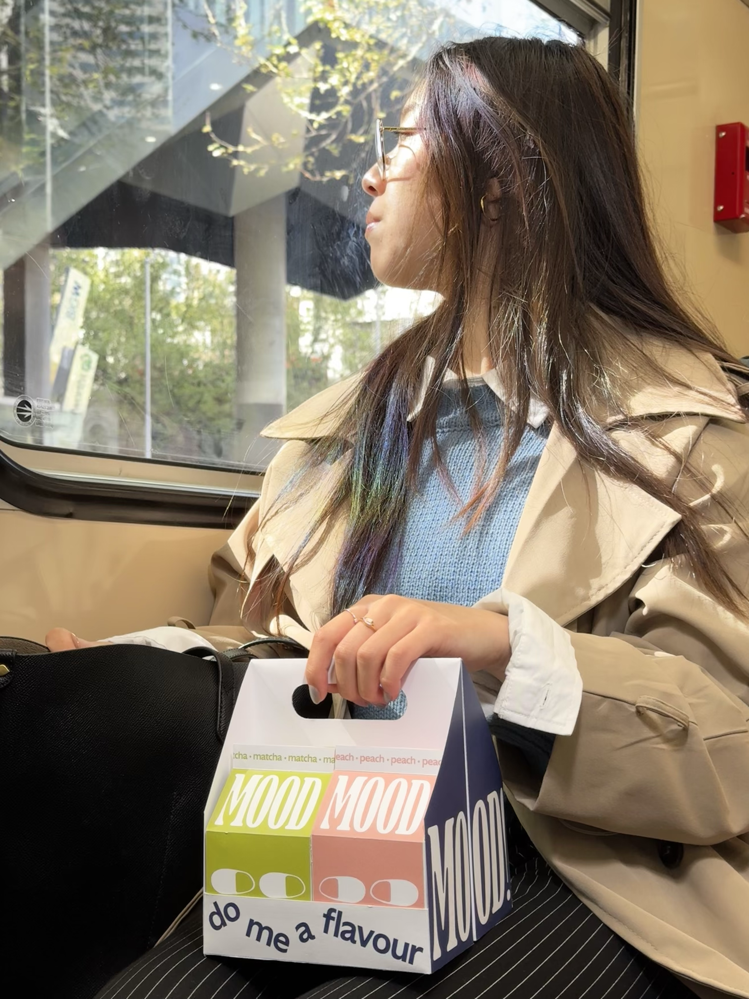
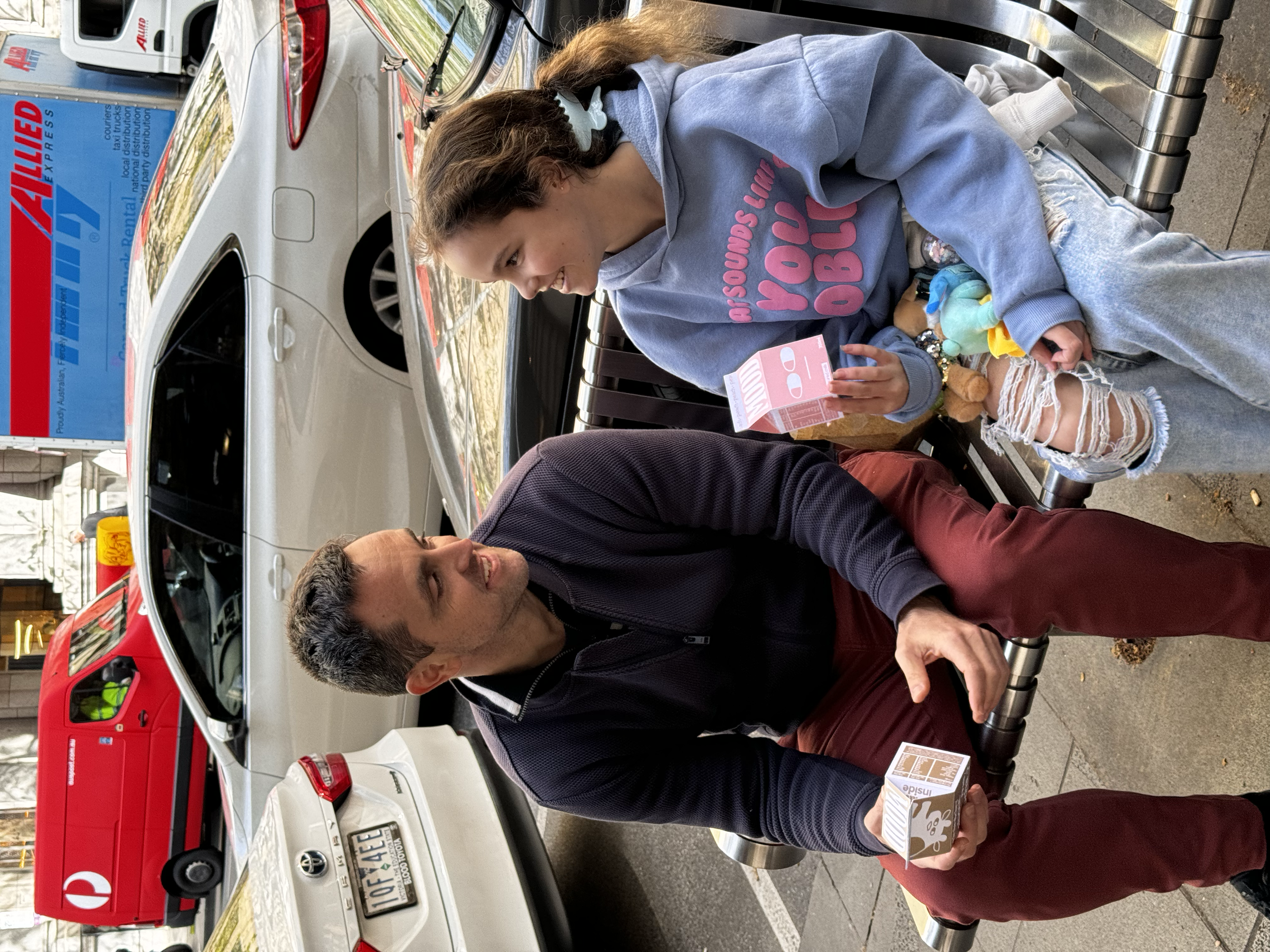
Our launch campaign centres around gaining market awareness through relatability, by presenting struggling corporate workers (akin to our target audience) drinking our products across our social media and advertising campaigns.
Given that we are a new brand, we believe some introductions are in order. As part of our marketing strategy, we developed 2 launch campaigns to spread brand awareness and introduce our brand values to the public.
Campaign 1:
Our first campaign, dubbed ‘Not in the Mood’, is our way of building connection, relatability and rapport with our target audience of young Zillenial workers stuck in the boring slug of corporate life.
Featuring models posing as members of our aforementioned target audience, this photoshoot campaign shows our product integrated into the lives of our target audience as bright spots of colour, fun and joy amongst the chaos and dullness of corporate life.
This campaign spans across our social media rollout, branded truck and logistics displays, as well as posters around the suburbs to spread maximum brand awareness and salience, while also conveying some of our brand personality.
marketing plan:


point of sales design:

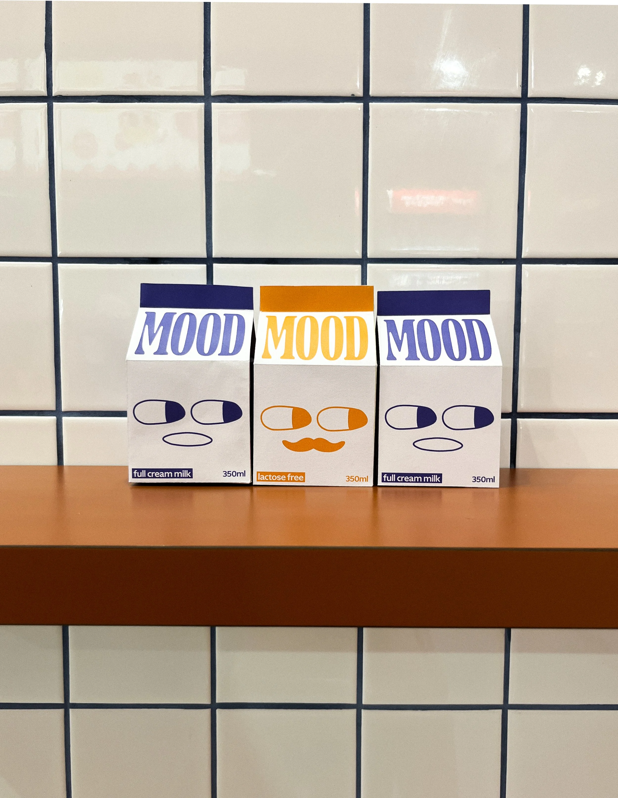
When presented with the mood prototypes, most interviewees appreciated the colour assortment offered throughout the mood flavour range. One stated they liked the serif font choice for the logo and how it was complimented by the sans-serif secondary typeface. However, some interviewees thought that the font was too small, and the shadows under the eyes of the mocha flavour did not fit with the other flavours. As a result, we made the logo font on the front of the carton larger, and changed the colours of the under eye bags to better fit aesthetically.
With regard to packaging shape and style, one interviewee disliked the idea of a straw, and stated that, like most millennials, she thought it was bad for the environment. As well as this, she did not like the idea of a lid on the carton, as she didn’t want to drink “bag temperature milk”. Multiple interviewees stated that the normal “retro style” tear- open packet was familar and nostalgic for adults. One interviewee likened the straw idea to a “sippy cup” and said it would be too infantalising for an adult market. As a result, we focused more on the tear-open packet style moving forward.
We had some interviewees who were confused by the flavour choices such as “taro” or “matcha”, whereas others were impressed, as they wanted something different from their usual flavoured milk, as well as more asian inspired flavours. This lead us to decide our final flavour would also be asian inspired, peach. The response to the taro flavour in particular was interesting as some participants likened it to taro bubble milk tea, and were excited to have an “on the go” flavoured version.
Some interviewees advised of flavours they’d like to see in the future, such as, Biscoff, caramel, tim tam, and tiramisu.
All the interviewees loved the mascot Timoothy, with some wanting more wacky drawings and sketches on the packaging. As such, we experiemented with using more of our hand-written typeface. Some interviewees with a background in graphic design advised that the sketched lines on the faces and timoothy were too thin, and that more colour was needed to make the packaging more eye catching. As a result we changed the line weight on our sketches and experimented with inverting the colours on the packaging, changing them from being majority white to being a majority coloured. Interviewees were also able to recognise the target audience with ease. They compared the brand to Paul’s Farmhouse Gold, seeing Mood as an “elevated” milk product for adults, when compared to competitors.
focus group interviews: